-
Shop
-
Trending
-
Theme
-
Patterns
-
Style
-
Coastal & Nautical
-
Flora
-
Fauna
-
Other
-
Soft & Trending
-
Neutrals
-
Earth & Natural Tones
-
Bold & Vibrant
Shop
PopularStyle and ThemeColor -


Ombre Wallpaper
Sort by:
34 products
34 products
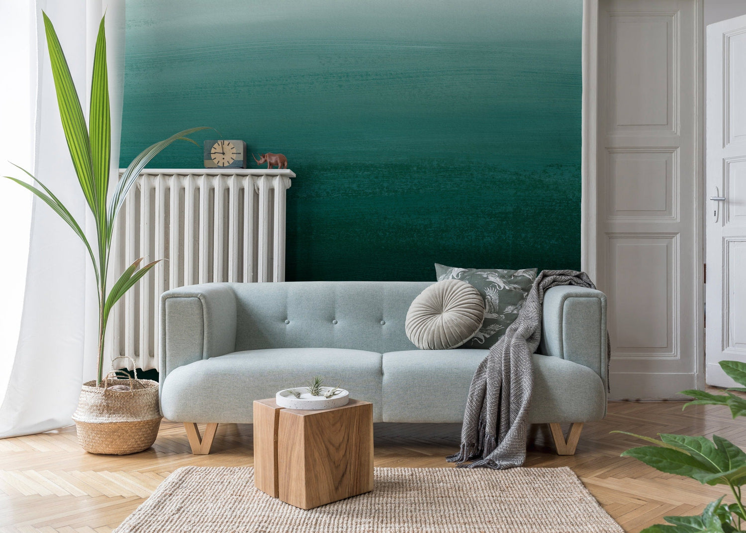
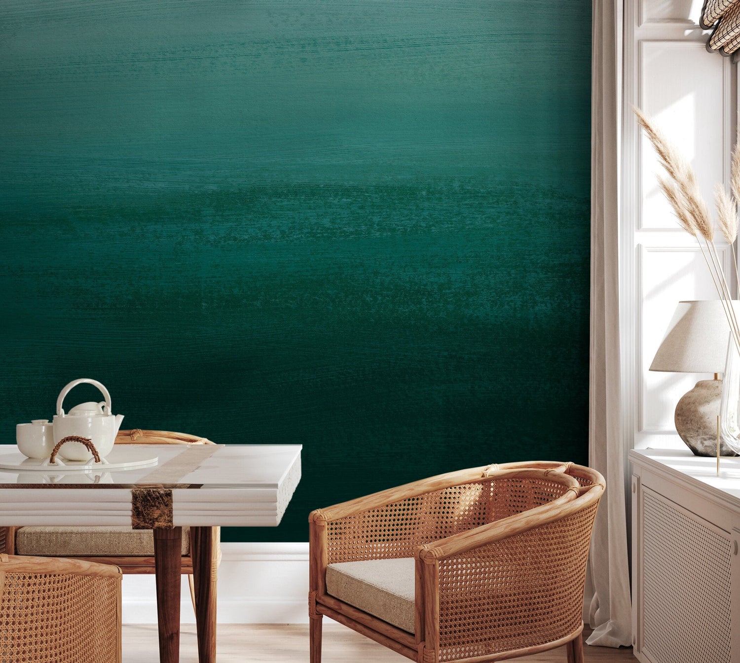
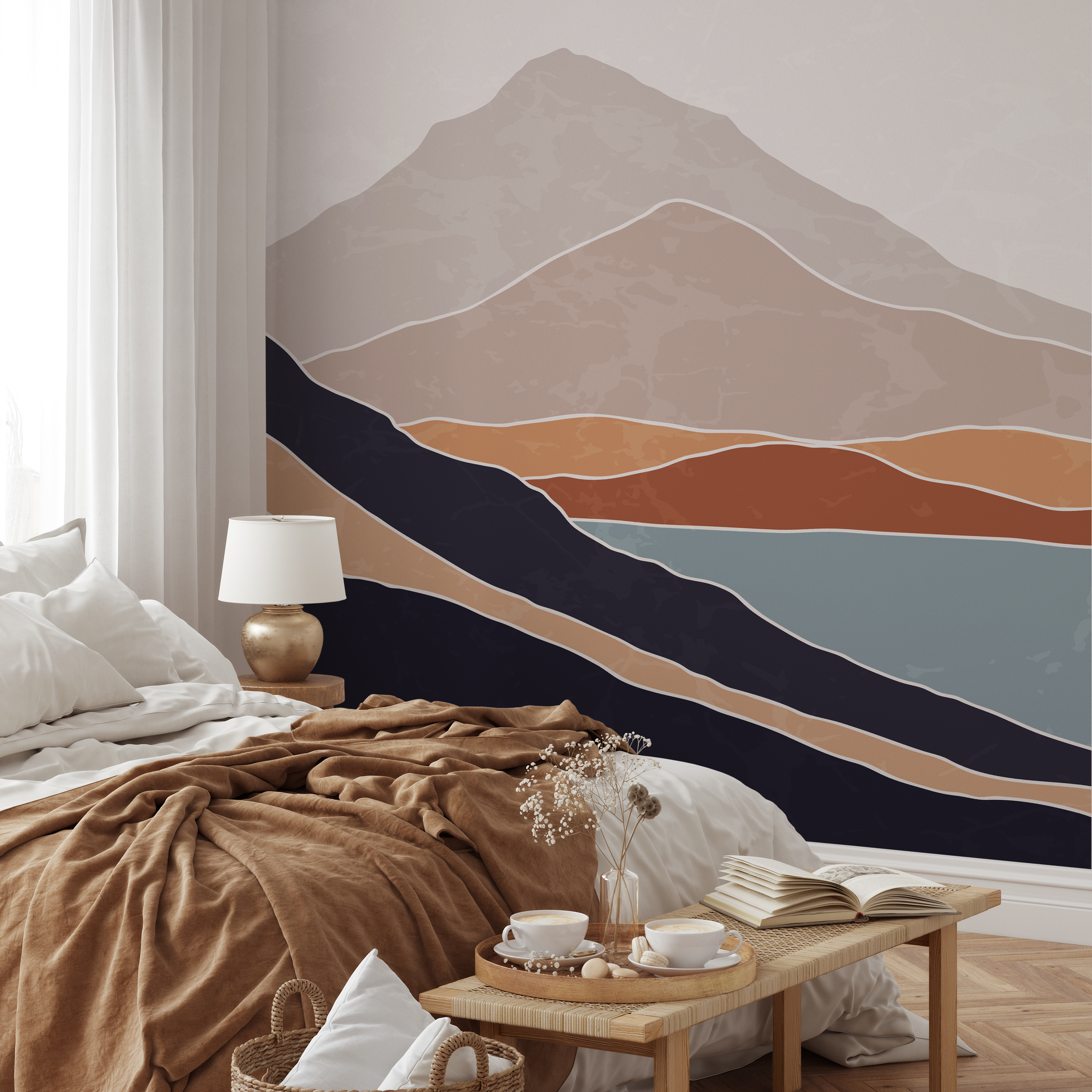
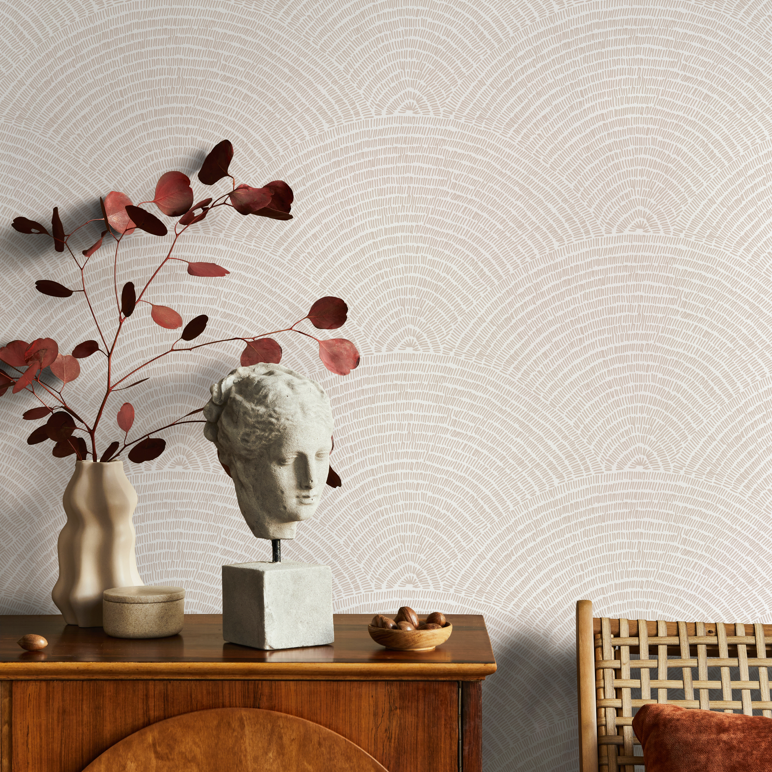
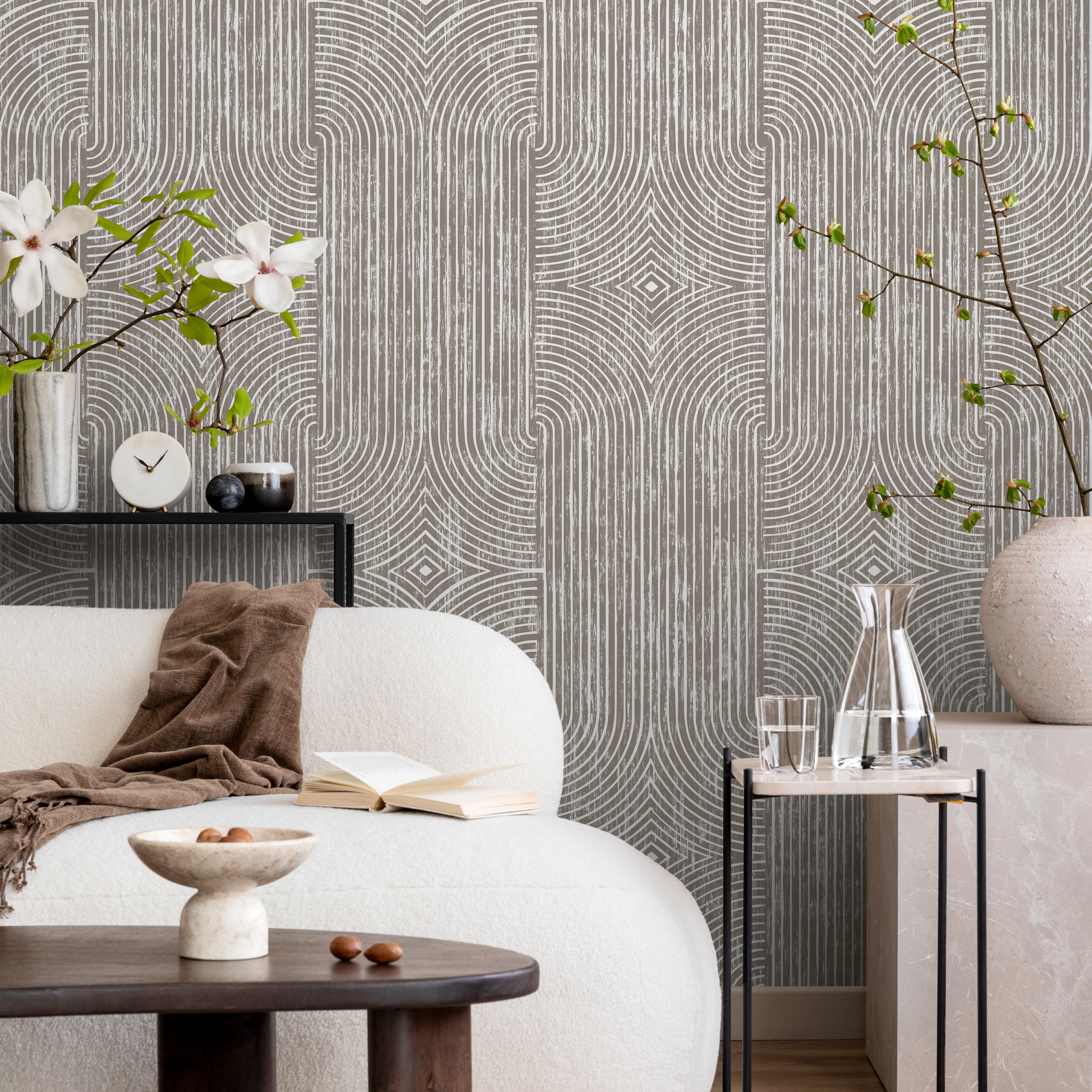
Ombre Wallpaper with a Textured Gradient in Emerald Green - X162
Ombre Wallpaper with a Textured Gradient in Emerald Green - X162
• Creates a stunning living room wallpaper or bedroom accent wall.
• Pairs beautifully with modern, minimalist, or contemporary furniture.
• Complements neutral paint colors like soft gray, beige, and off-white.
• Available in custom wallpaper sizes for a perfect fit in any room.
• Choose from premium peel and stick or traditional wallpaper options.
• Features damage-free removal, making it ideal rental property decor.
• Request personalized wallpaper with custom color options for your space.
• Proudly Made in the USA with non-toxic, eco-friendly wallpaper.
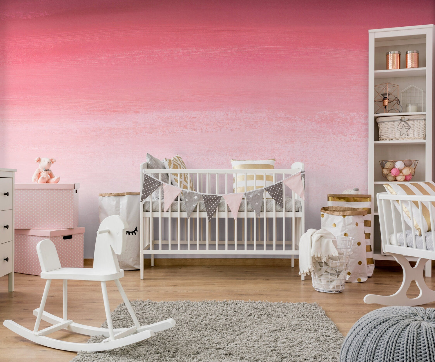
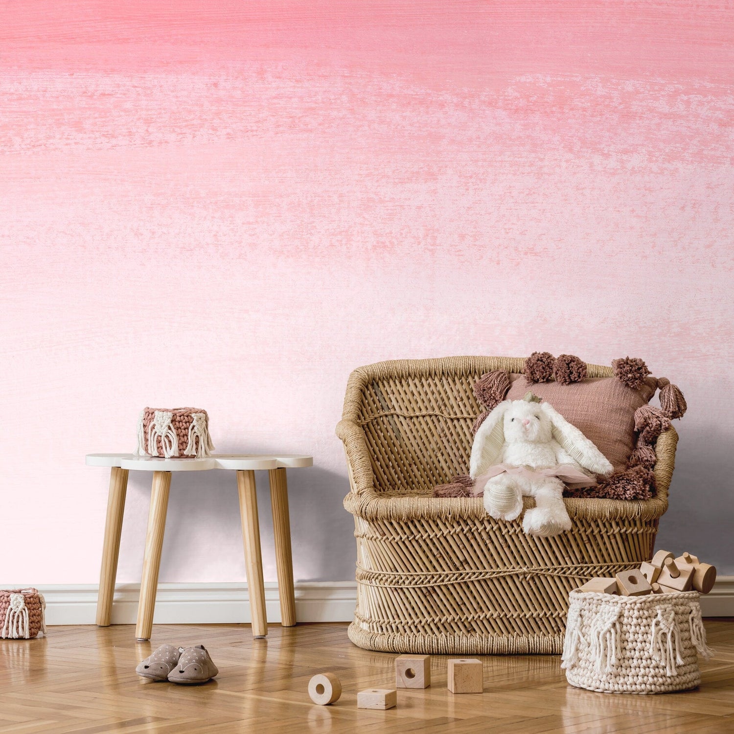
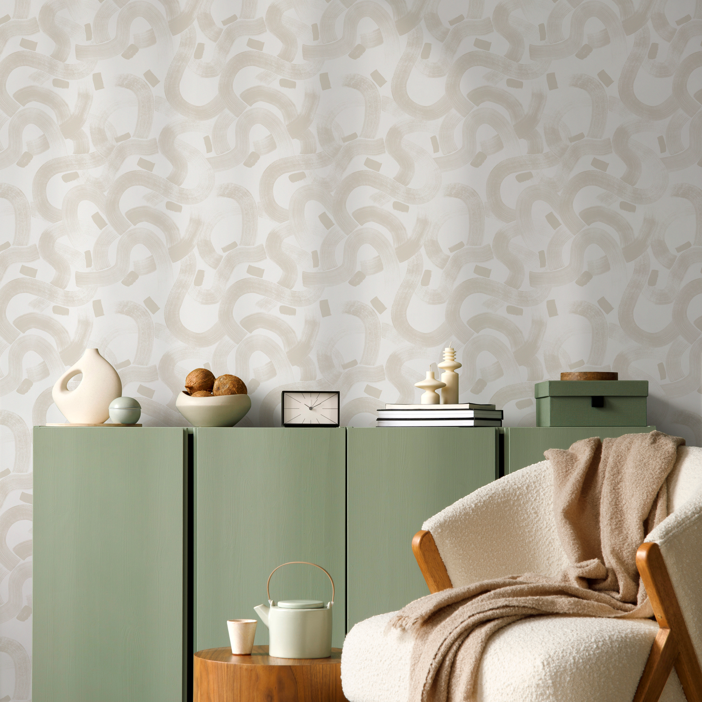
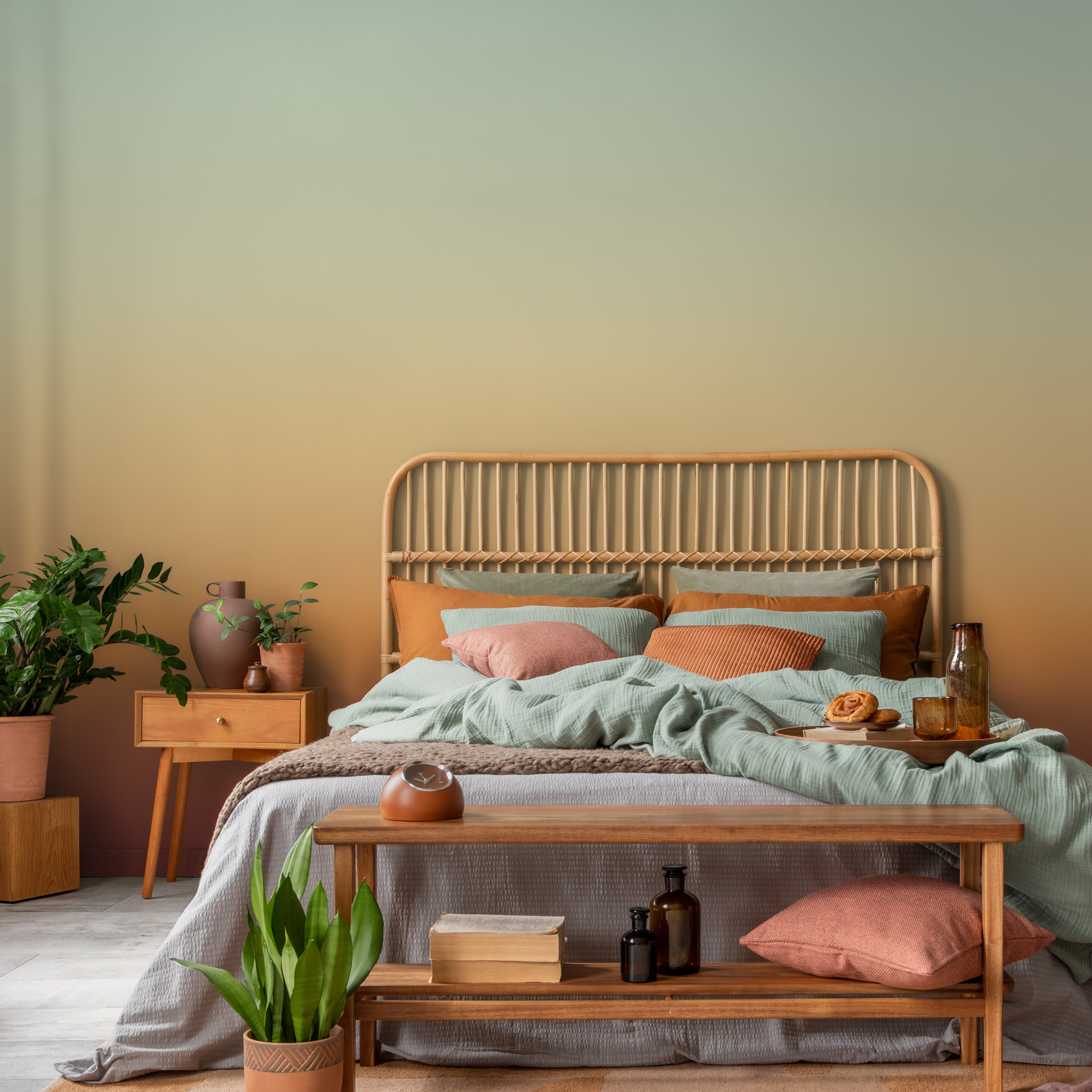
Ombre Wallpaper with a Painted Texture in Pink and White - X163
Ombre Wallpaper with a Painted Texture in Pink and White - X163
• Perfect for living room wallpaper, bedroom wall decor, or a nursery accent wall.
• Pairs beautifully with modern furniture, minimalist decor, and Scandinavian design.
• Complements walls with soft white paint, warm gray tones, or even navy blue.
• Our custom wallpaper sizes are made to order, ensuring a perfect fit for any room.
• Choose from premium peel and stick or traditional wallpaper options for your project.
• Enjoy damage-free removal, making this the ideal temporary wall decor for renters.
• We offer personalized wallpaper with custom color options to create bespoke wall art.
• Proudly Made in USA using eco-friendly wallpaper and non-toxic, sustainable ink.


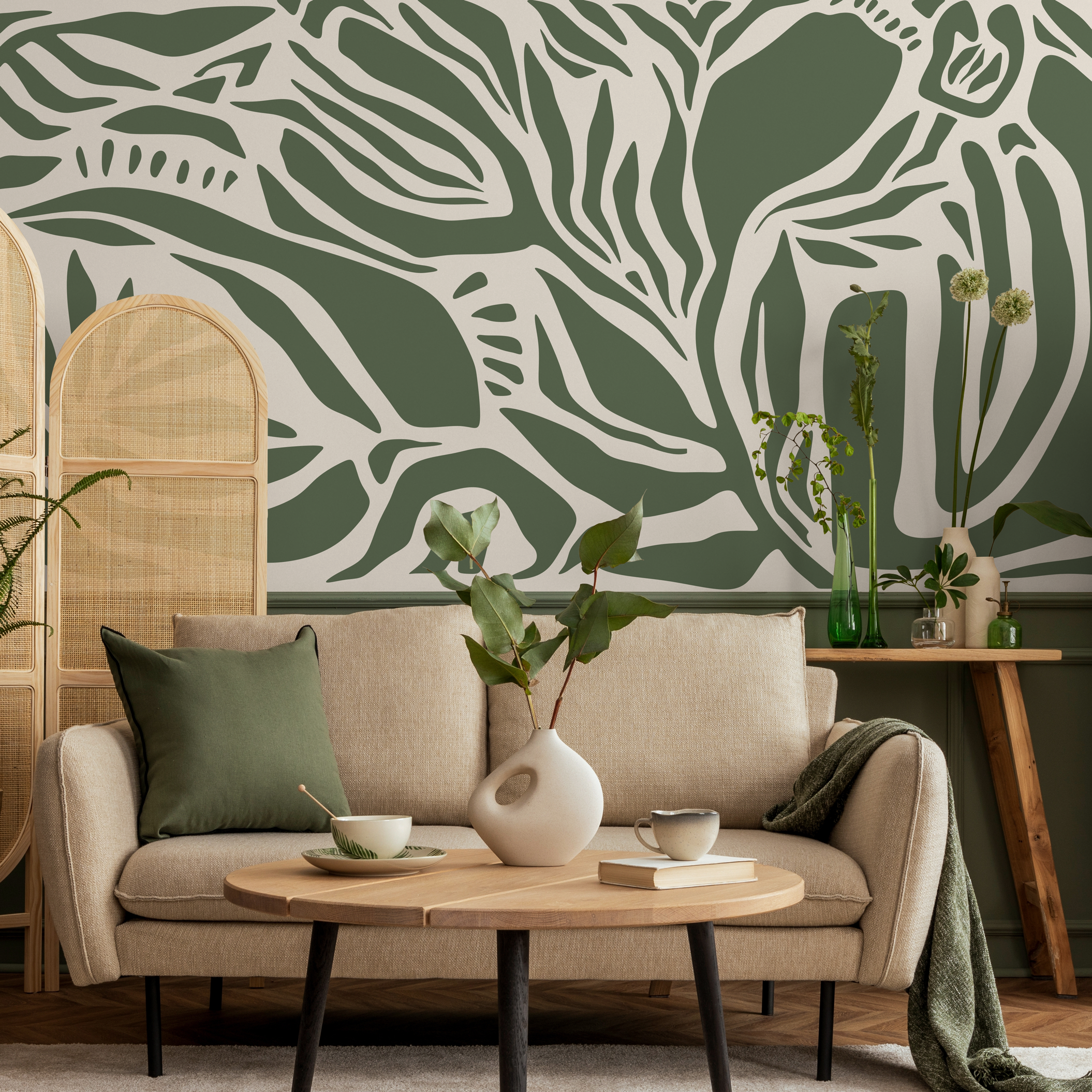
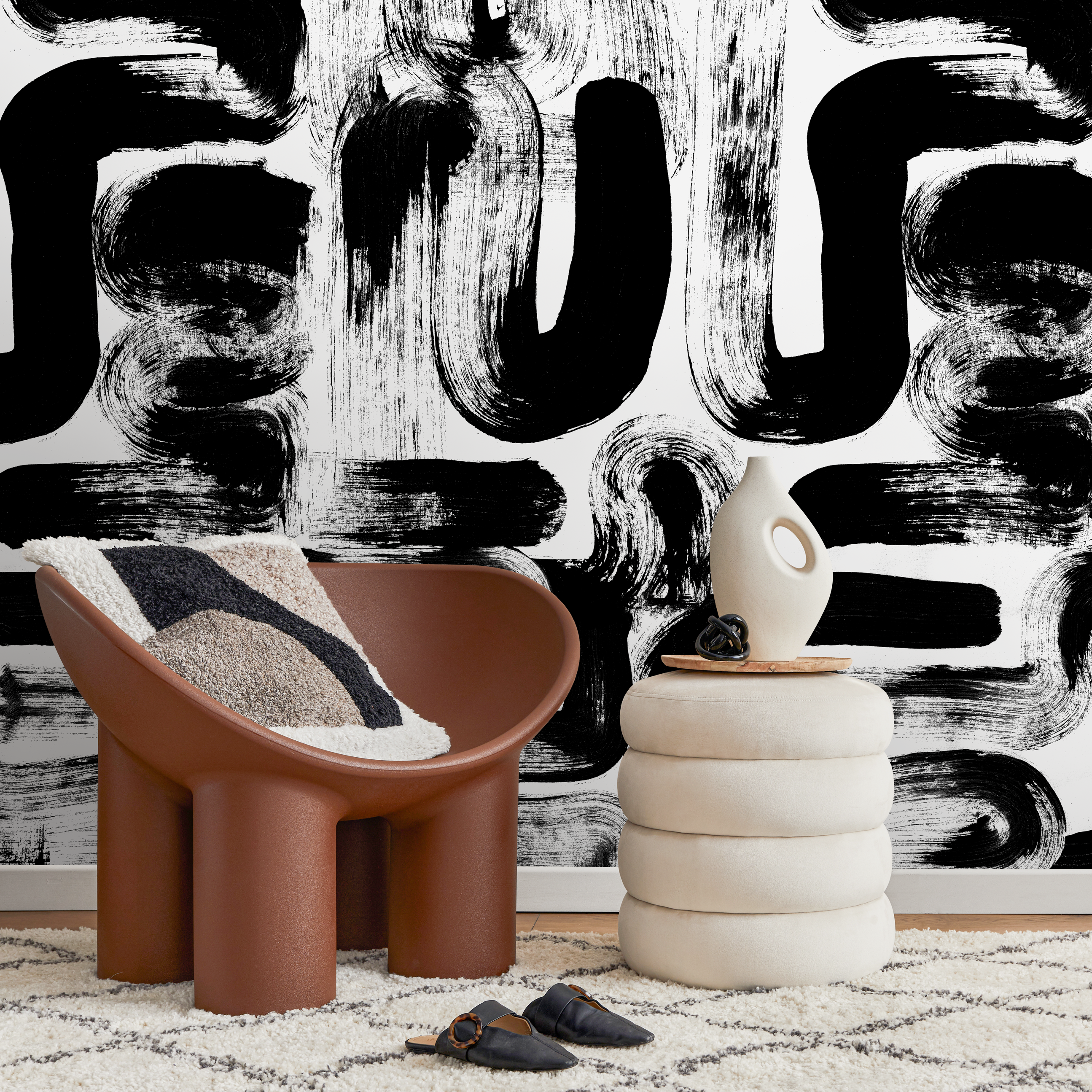
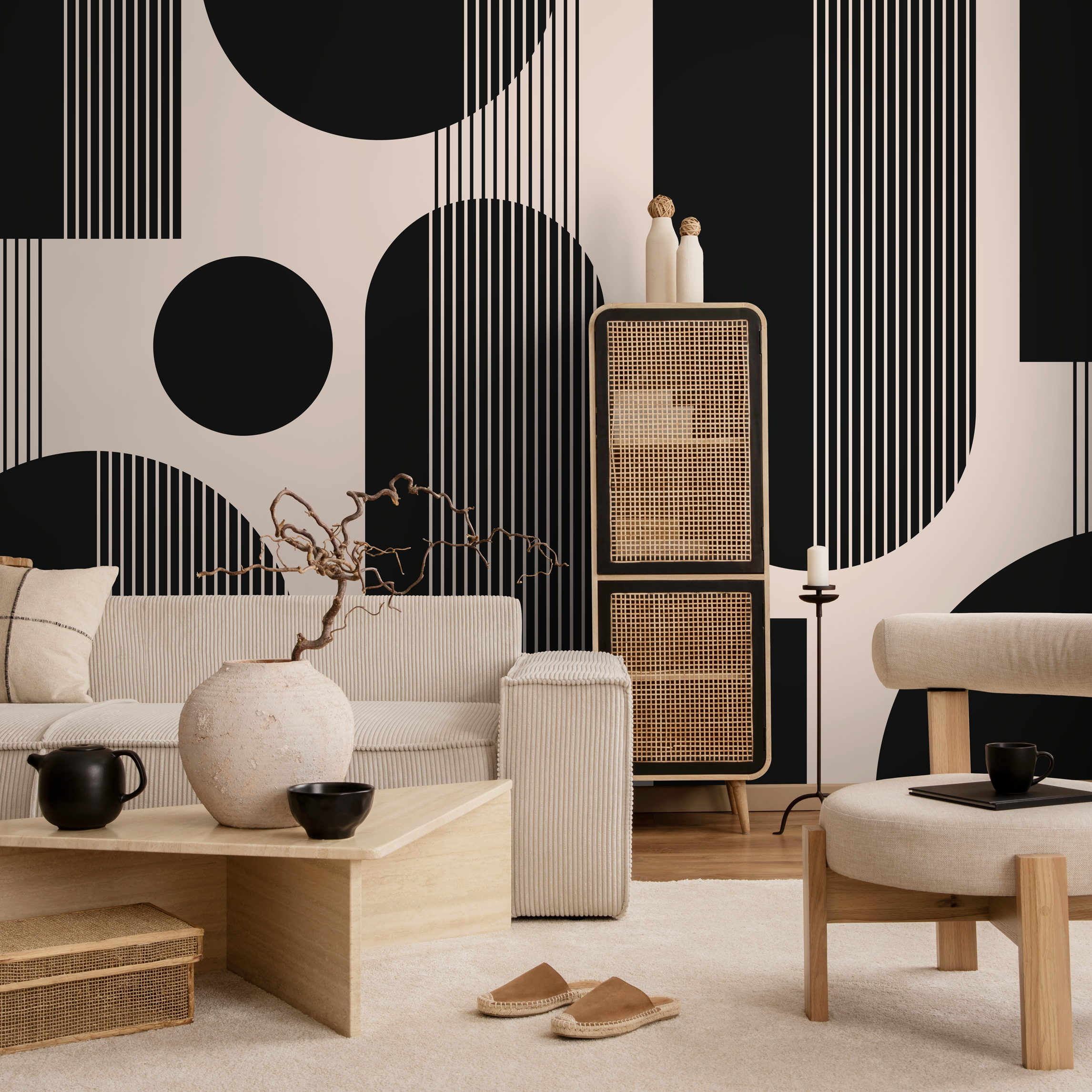
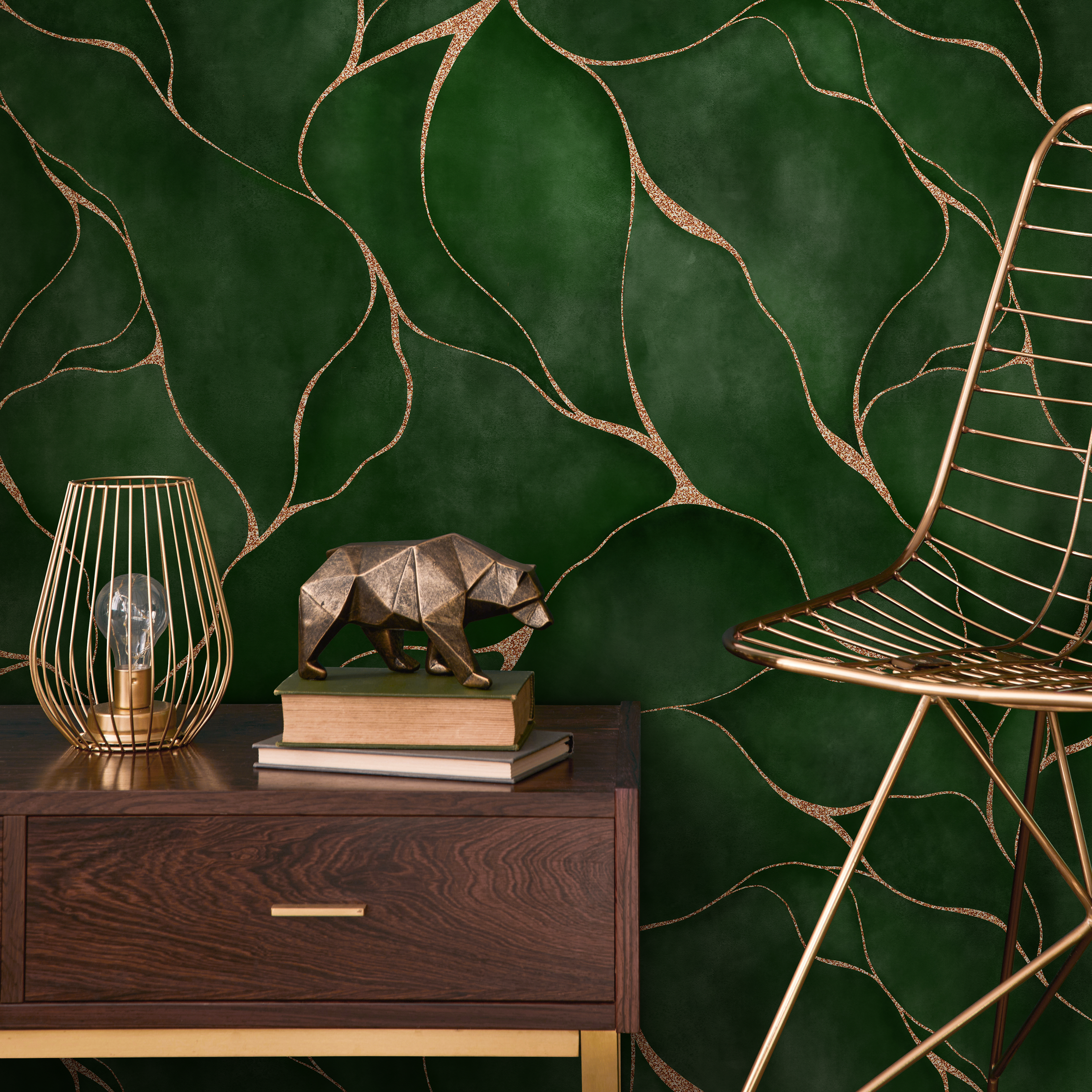
Abstract Wallpaper with an Ombre Effect in Green and Black - X160
Abstract Wallpaper with an Ombre Effect in Green and Black - X160
• Ideal for bedroom wallpaper, living room wall decor, or a dining room accent wall.
• Pairs beautifully with modern furniture, minimalist design, and natural wood tones.
• Complements walls painted in charcoal gray, soft off-white, or deep navy blue.
• Available in custom wallpaper sizes to guarantee a perfect fit for any room size.
• Choose from premium peel and stick or traditional wallpaper for your ideal finish.
• Features damage-free removal, making it a perfect rental property friendly option.
• Ask about personalized wallpaper and custom color options for a bespoke wall art look.
• Proudly Made in the USA with non-toxic materials for sustainable home decor.
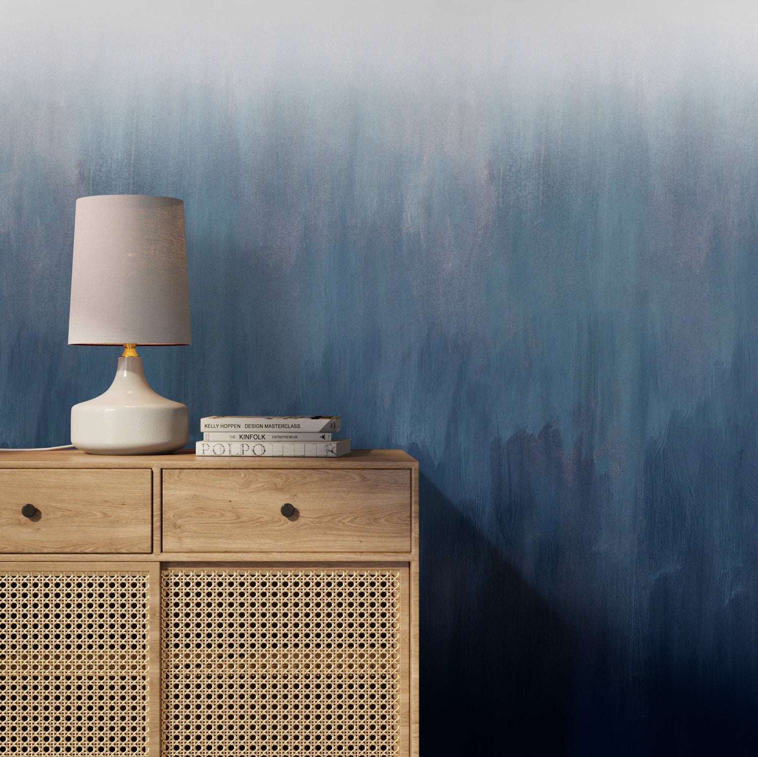
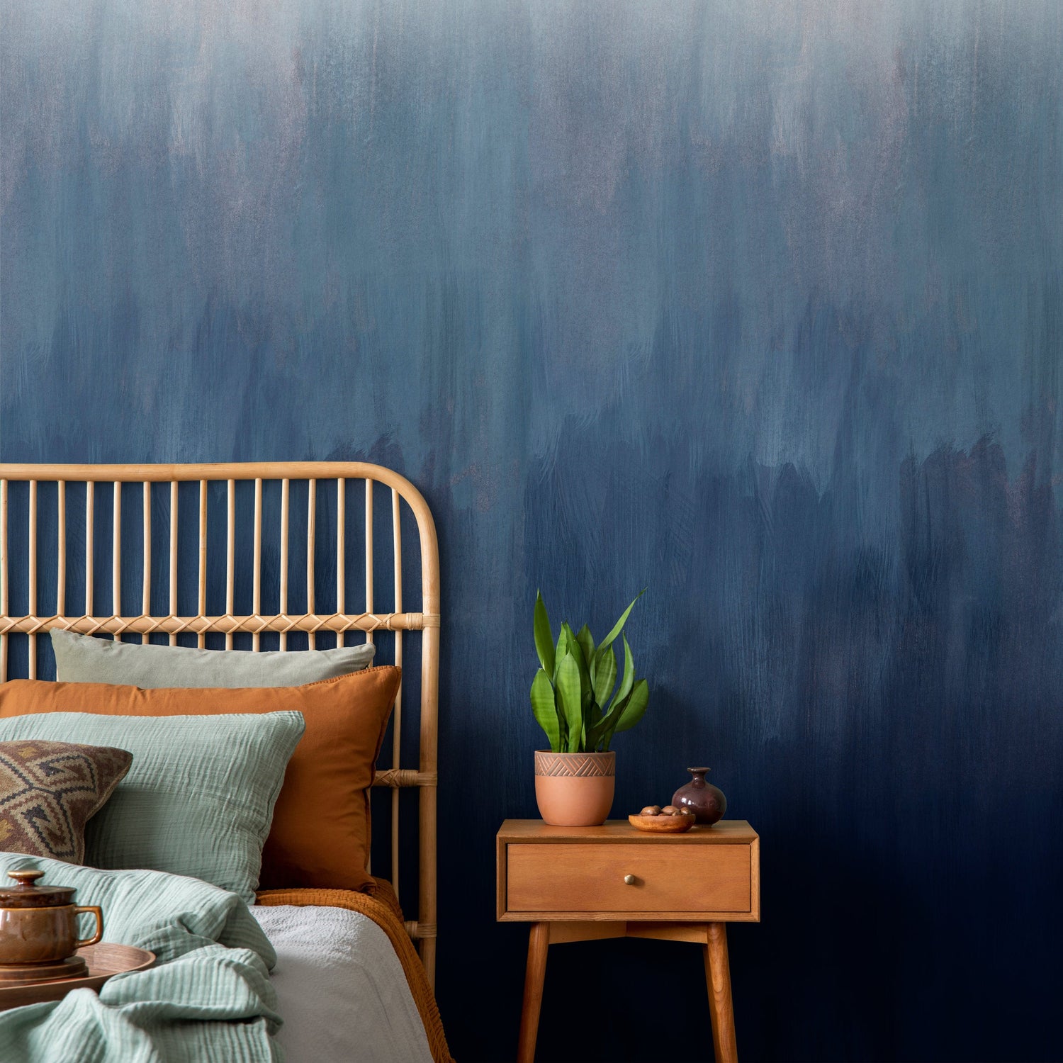
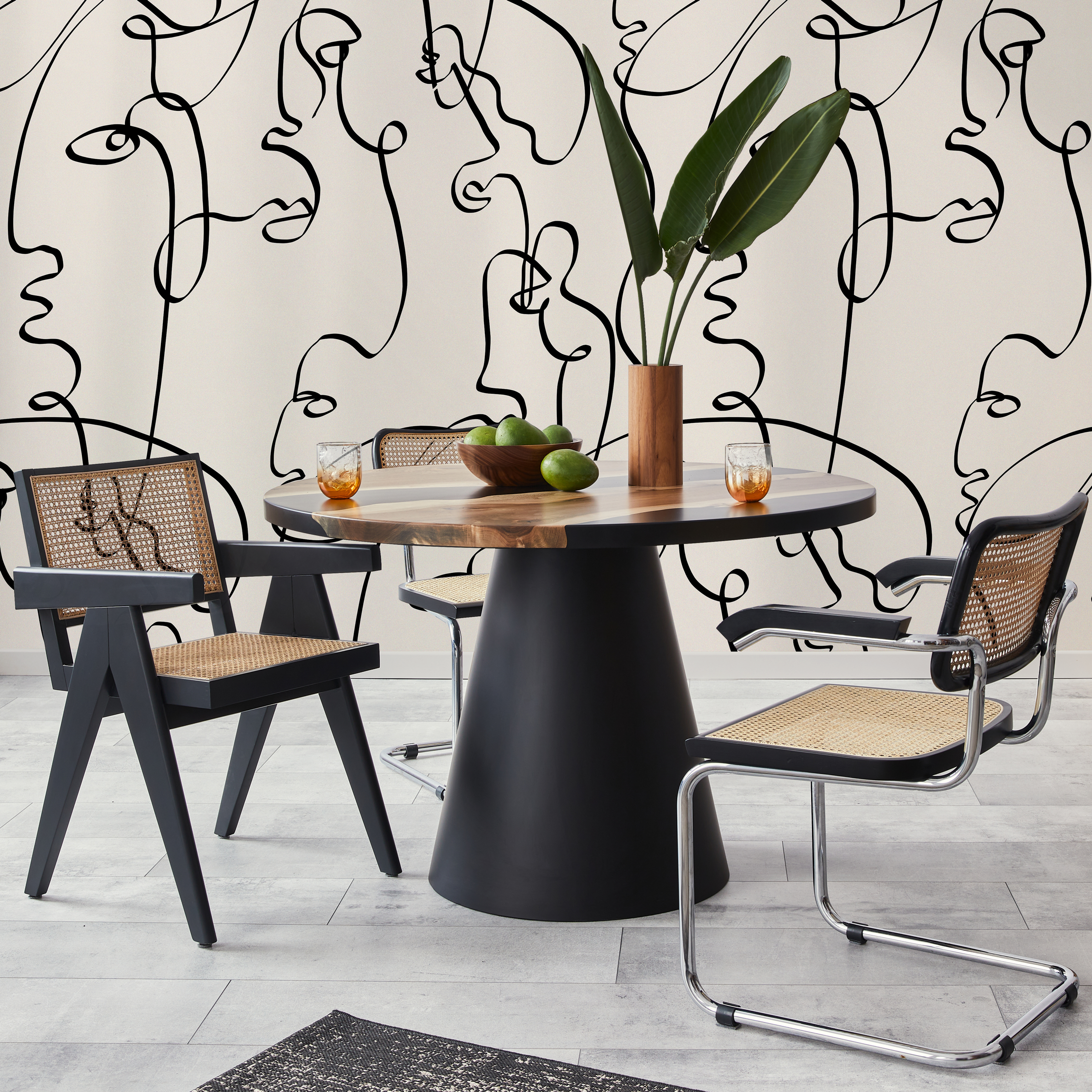
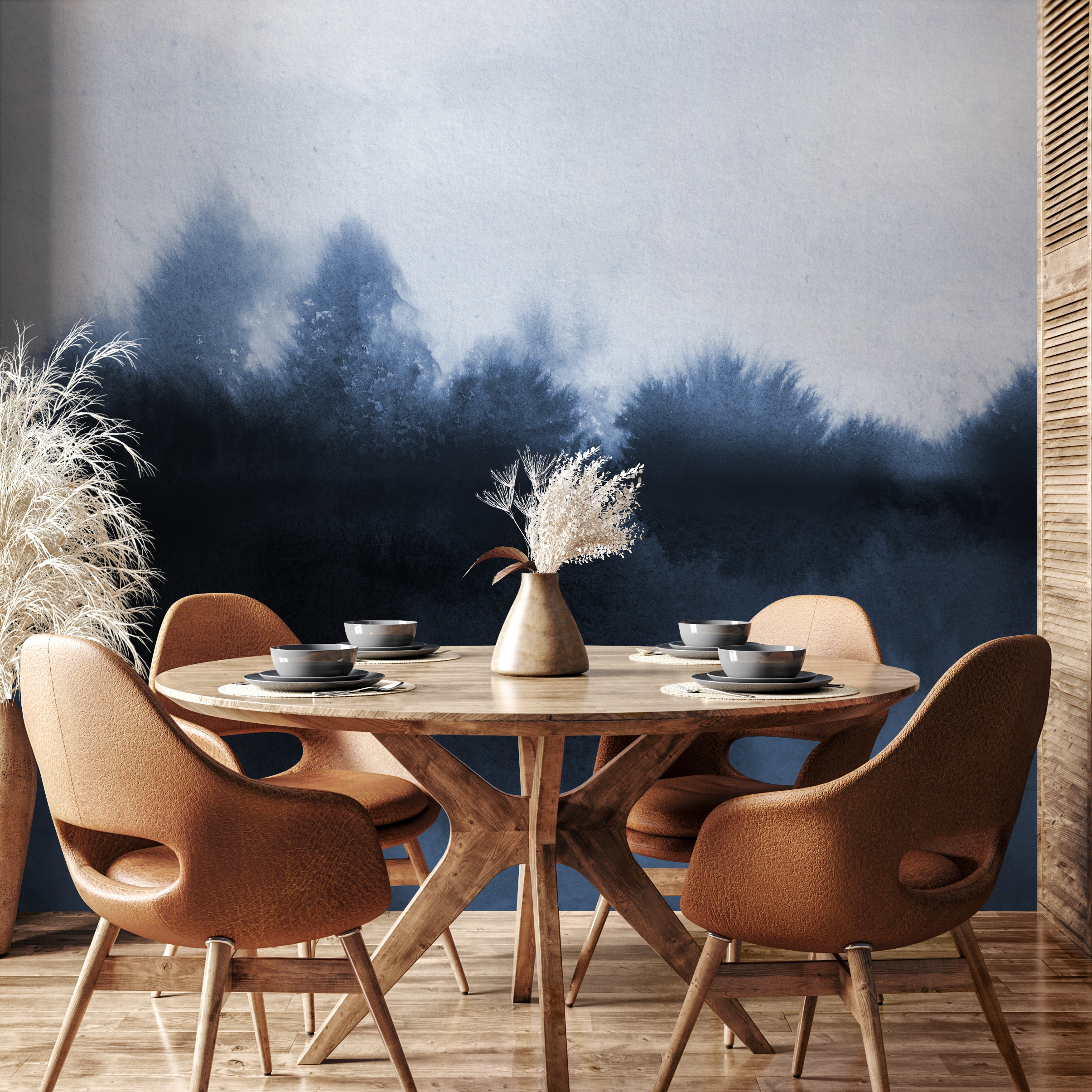
Abstract Wallpaper with a Painterly Ombre Gradient in Blue and White - X159
Abstract Wallpaper with a Painterly Ombre Gradient in Blue and White - X159
• Perfect for bedroom wall decor, a living room wallpaper, or a dining room accent wall.
• Pairs beautifully with modern furniture, coastal decor, and minimalist design styles.
• Complements walls painted in crisp white, soft gray, or even sandy beige tones.
• Available in custom wallpaper sizes to ensure a perfect fit for any room size.
• Choose from premium peel and stick or traditional wallpaper for your specific needs.
• Ideal for temporary wall decor with guaranteed damage-free removal for renters.
• Create bespoke wall art with our personalized wallpaper and custom color options.
• Proudly Made in the USA using non-toxic materials for eco-friendly home decor.
Ombre Wallpaper — Stunning Gradient Color for Your Walls
Ombre wallpaper brings the mesmerizing beauty of gradual color transitions to your walls — soft fades from dark to light, one hue melting into another, or colors dissolving into white like a watercolor left in the rain. The word "ombré" comes from the French for "shaded" or "shadow," and the technique has deep roots in textile traditions worldwide. Japanese "shibori" dyers have created controlled gradient effects for centuries; Indian "bandhani" fabrics feature natural color gradients from tied-resist dyeing; and European fashion discovered ombré in the early 1800s when dip-dyed silks became the height of Parisian elegance. In interior design, ombre wallpaper channels this same ethereal beauty — creating atmospheric, painterly walls that shift and breathe with light. ONDECOR's ombre wallpaper collection features gradients in every color — from soft pastel fades to dramatic dark-to-light transitions and multi-hue blends. Available in peel and stick and traditional formats, made in the USA and PVC-free.
What makes ombre wallpaper uniquely impactful is its ability to create atmosphere without pattern — the color itself is the design. Where patterned wallpapers add visual interest through repeating motifs, ombre achieves interest through pure color movement, creating walls that feel more like painted skies or watercolor canvases than traditional wall coverings. This quality makes ombre one of the most photogenic wallpaper styles — it creates stunning backdrops for rooms, photos, and video calls while maintaining a clean simplicity that never competes with furniture or decor. ONDECOR's ombre collection captures this atmospheric magic across a wide color range.
Best Rooms for Ombre Wallpaper
Bedroom: Ombre bedroom wallpaper creates a dreamlike atmosphere — a gradient that fades from deep color at the base to soft white at the ceiling creates a sense of floating, transitioning from grounded to ethereal as your eyes travel upward. This effect is profoundly calming, making it ideal for sleep spaces.
Nursery: Soft ombre gradients in pastel blue, blush pink, mint green, or lavender create gentle, soothing nursery environments. The gradual color shift is visually stimulating for infants without being jarring — a perfect balance of interest and calm. ONDECOR's PVC-free materials are safe for children's rooms.
Living Room: An ombre accent wall in the living room creates an artistic focal point that's uniquely different from traditional patterns. The gradient effect draws the eye and creates visual movement without the busyness of printed patterns. Deep blue, green, or gray ombre walls make particularly strong statements.
Bathroom: Ombre wallpaper in a bathroom creates spa-like atmospheric beauty — imagine a gradient from deep ocean teal to soft seafoam, or warm sand to cream. The color transition evokes natural horizons and creates an immersive, calming bathing environment.
Stairwell: Stairwells are an underrated ombre canvas — the vertical span perfectly showcases top-to-bottom gradient transitions, creating a dramatic visual journey as you ascend or descend.
How to Style Ombre Wallpaper
Ombre's atmospheric quality means styling should enhance the gradient effect rather than compete with it.
Match the mood: Light, airy ombre fades call for soft, minimal furnishings — white, cream, and natural materials that don't fight the gradient's gentle progression. Deep, dramatic ombre walls pair with richer furniture — dark wood, velvet upholstery, and metallic accents that hold their own against the color intensity.
Anchor the lighter end: Since ombre walls typically fade to white or pale at the top, use darker-toned furniture and rugs at the base to ground the room. This creates a natural visual weight distribution — heavy below, airy above — that feels both balanced and ethereal.
Keep patterns minimal: Ombre wallpaper is a statement in itself. Pair with solid-color furnishings and minimal accessories. Patterned fabrics and busy decor compete with the gradient effect and dilute its impact.
Complementary accents: Pull accent colors from the ombre's palette — the deepest tone in cushions, the mid-tone in a throw, the lightest in ceramics. This creates a room that feels completely integrated with the wall.
The transition zone: In rooms with ombre wallpaper, the color's lightest point typically meets the ceiling. For the most polished look, paint the ceiling in a color that matches or closely complements the ombre's lightest tone — this creates a seamless visual transition rather than a jarring line. If your ombre fades to white at the top, a clean white ceiling extends the effect naturally. For ombre that fades to cream or soft color, match accordingly.
Popular Ombre Wallpaper Patterns & Designs
ONDECOR's ombre wallpaper collection is engineered for the smooth, uninterrupted color transitions that define this style. Our printing technology delivers gradient shifts with no visible banding, stepping, or color breaks — the transition from dark to light appears truly continuous, as if the wall were hand-painted with a masterful color wash. This technical quality is essential for ombre because any printing imperfection is immediately visible in the absence of pattern to camouflage it.
Single-color gradients are the classic ombre — one color transitioning from deep to light (or vice versa). Blue ombre (navy to sky to white) is the most popular, followed by pink (rose to blush to cream) and green (forest to sage to mint). These create atmospheric, sky-like walls. Multi-hue blends transition between different colors — sunset gradients (orange through pink to purple), ocean fades (teal through blue to seafoam), and abstract color journeys that create uniquely artistic walls.
Watercolor ombre designs combine gradient transitions with the soft, feathered edges of watercolor technique — the color doesn't just fade linearly but bleeds and blooms organically, creating painterly atmospheric effects. Cosmic ombre patterns blend deep space colors — midnight navy, purple, and black with scattered star effects — creating galaxy-inspired gradients.
For abstract approaches, ombre combined with subtle texture — gradient color over a linen or plaster surface — adds tactile dimension to the color transition. And for nurseries, soft pastel ombre designs in gentle rainbow sequences create magical, dreamy environments.
Ombre vs Gradient vs Color-Fade vs Dip-Dye Wallpaper
These terms describe the same essential effect — gradual color transition — but carry slightly different connotations. Ombre wallpaper is the most recognized term, implying a deliberate, fashion-inspired fade from dark to light. It carries the aesthetic weight of its textile heritage and suggests sophistication and intentionality.
Gradient wallpaper is the most technical term — it describes any smooth transition between colors or values. Gradient is broader than ombre because it includes multi-directional color shifts (not just top-to-bottom or side-to-side). Color-fade wallpaper emphasizes the dissolving quality — color appearing to evaporate or dissipate, often into white or pale backgrounds. It suggests a softer, more organic effect than the precision-sounding "gradient."
Dip-dye wallpaper references the textile technique of partially submerging fabric in dye — the color is strongest at the dipped end and fades toward the undipped portion. Dip-dye patterns tend to feel more craft-inspired and organic, with visible variation in the color transition. ONDECOR uses the term "ombre" broadly to encompass all these gradient effects — the key quality they share is that mesmerizing, atmospheric color journey across your wall.
Ombre wallpaper has become increasingly popular for photography studios, content creation spaces, and video call backdrops because the smooth gradient creates a professional, visually interesting background that doesn't distract from the subject. This practical application extends to home offices — an ombre accent wall behind your desk creates a polished, interesting video call background that colleagues and clients notice and appreciate.
Peel and Stick vs Traditional Wallpaper
Every ombre wallpaper at ONDECOR comes in peel and stick and traditional formats. Peel and stick is popular for ombre because the bold, atmospheric quality of gradients benefits from test-driving in your actual space — peel and stick lets you see the full gradient effect before committing permanently. Traditional wallpaper delivers a seamless, permanent finish for ombre walls you want to keep. Both use identical PVC-free materials with smooth, continuous color reproduction.
How Much Wallpaper Do I Need?
ONDECOR uses a tiled panel system — panels match side by side (straight match), not drop match. This is especially important for ombre designs, where the gradient must flow continuously across panels without visible color jumps at seams. Measure your wall width × height for your order.
The tiled format is essential for ombre wallpaper because smooth gradient transitions need panels that align perfectly in both color and position. ONDECOR's system ensures the gradient reads as one continuous color journey. Custom sizing matches your exact wall dimensions, and free samples help you evaluate how gradient colors read in your specific lighting.
Why Choose ONDECOR Ombre Wallpaper
ONDECOR's ombre collection features gradient designs that are precisely calibrated for smooth, seamless color transitions. Every panel is made in the USA on PVC-free, eco-friendly materials with printing technology that captures the subtle, continuous color shifts ombre demands. Our tiled panel system ensures perfect gradient continuity across panels — no color jumps, no visible seam disruptions. Free samples let you evaluate gradient colors in your lighting. Custom sizing ensures panels match your exact wall, and free design help guides color and placement decisions. Browse below and bring atmospheric gradient beauty to your walls.
Related Collections
- Watercolor Wallpaper
- Abstract Wallpaper
- Pastel Wallpaper
- Blue Wallpaper
- Pink Wallpaper
- Green Wallpaper
- Galaxy Wallpaper
- Minimalist Wallpaper
- Nursery Wallpaper
- Peel and Stick Wallpaper
Frequently Asked Questions
What is ombre wallpaper?
Ombre wallpaper features designs with gradual color transitions — one shade fading into another, or a color dissolving from deep to light. The effect creates atmospheric, painterly walls that shift mood across the surface.
Does ombre wallpaper work in small rooms?
Yes — ombre effects that fade from darker at the base to lighter at the top create a sense of vertical openness. Light-toned gradients can make small rooms feel more spacious and airy.
What colors are most popular for ombre wallpaper?
Blue ombre (navy to sky to white) is the most popular, followed by pink, green, and gray gradients. Sunset multi-hue blends and galaxy-inspired deep-space gradients are also bestsellers.
Can ombre wallpaper be applied horizontally?
Yes. While top-to-bottom gradients are most common, side-to-side ombre effects work beautifully too, especially on long accent walls. ONDECOR's tiled panel system supports both orientations.
How do panels handle the ombre gradient at seams?
ONDECOR's tiled panels are precisely calibrated so the gradient continues seamlessly across panel edges. The straight-match system ensures no visible color jumps — the gradient reads as one continuous transition.


